In case you missed yesterday’s blog titled The Mother Of All Real Estate Reports v. II, you might want to start with that as today’s post is a continuation of the monthly real estate graphs that we report on regularly at the Tallahassee Real Estate Blog. As a reminder, we routinely cover charts, graphs, and analysis at the Tallahassee Housing Report on our website.
Closed Home Sales By Area In Tallahassee
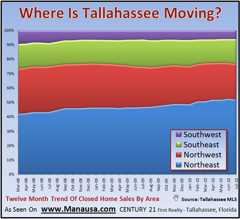
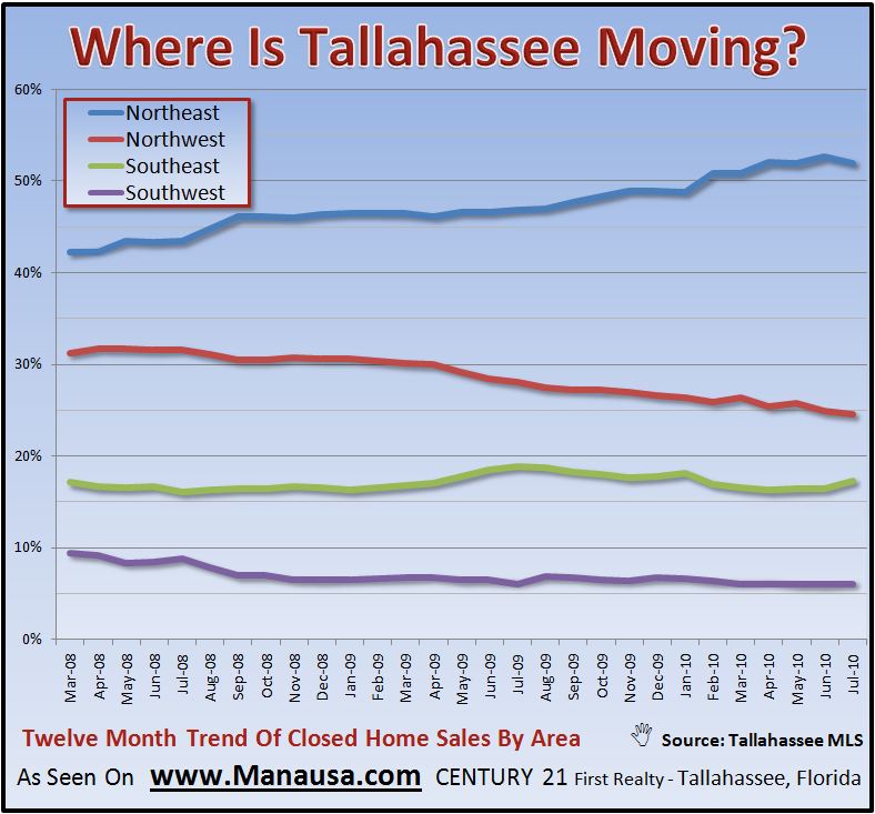
One interesting real estate graph that we assemble and monitor shows where people are moving in our market area. While it is not surprising to find that more than 1/2 of the sales are in the Northeast section of Leon County, I find it interesting to see how the rest of our market compares.
The boom in the housing market created a rush in the SW, but lately more people are moving to the North side of town than the south. The same information can be displayed to see that NE Leon County is growing, the NW is shrinking (market share), the SE is holding its own, while the SW has seen its share of the housing market nearly cut in half in the past two and 1/2 years.
Months Of Supply Of Homes For Sale In Tallahassee
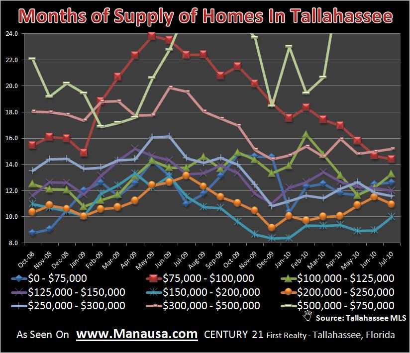
The following real estate graph shows months of supply of homes for sale in Tallahassee by price range. The graph is very “busy,” but it contains a great snapshot of the glut of homes for sale. Note how the left axis which measures months of supply starts at “8.” This is not very good, as most people recognize 5 to 6 months of supply as a market in equilibrium.
Closed Home Sales By Price Range
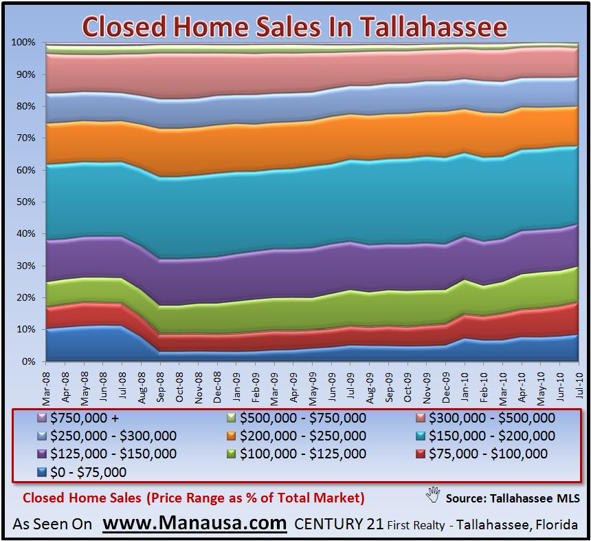
The real estate graph above showed current inventory by price range, the one below shows how the market is composed in terms of closed home sales by price range. Note how large the aqua portion is (homes priced from $150,000 to $200,000).
Tomorrow, we will finish up the series of “Mother Of All Real Estate Reports v. II” with a great final set of real estate graphs. Don’t forget to check back in!


