

I learned a long time ago that a picture is worth 1,000 words, so today’s “Mother of All Real Estate Reports v. II” will be mostly graphical in nature. For detailed analysis of individual graphs, you are welcome to visit the Tallahassee Housing Report for an in-depth and current study of the Tallahassee real estate market.
Yesterday’s real estate report on Pending Home Sales in Tallahassee showed that the market is in a significant decline since the end of the Homebuyer Tax Credit, but we have so many more graphs of the market that can show us how things are compared to how they have been.
Residential Sales Trends In Tallahassee
This first real estate graph shows that the average home price has dropped, but more importantly, the number of homes selling each month is lower than at any time going back to 1991!

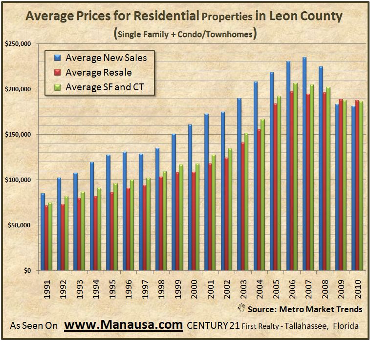
Average Prices For Residential Properties In Tallahassee
When we look at the average price report for Tallahassee homes, we see that the biggest change is in what home builders are doing. Look how the blue line has dropped to adapt to what home buyers are buying.
Single Family Home Prices
When we look at single family detached homes as an isolated group, we can see that the average price has gone from $222K to $187K. Some people in real estate would tell you this is THE measurement of depreciation, but is it?

Average Real Estate Prices In Tallahassee
The next real estate graph shows that for the most part, average real estate prices are dropping. But notice how the average condo/townhome price is rising! Could this have something to do with the downtown condo market in Tallahassee?

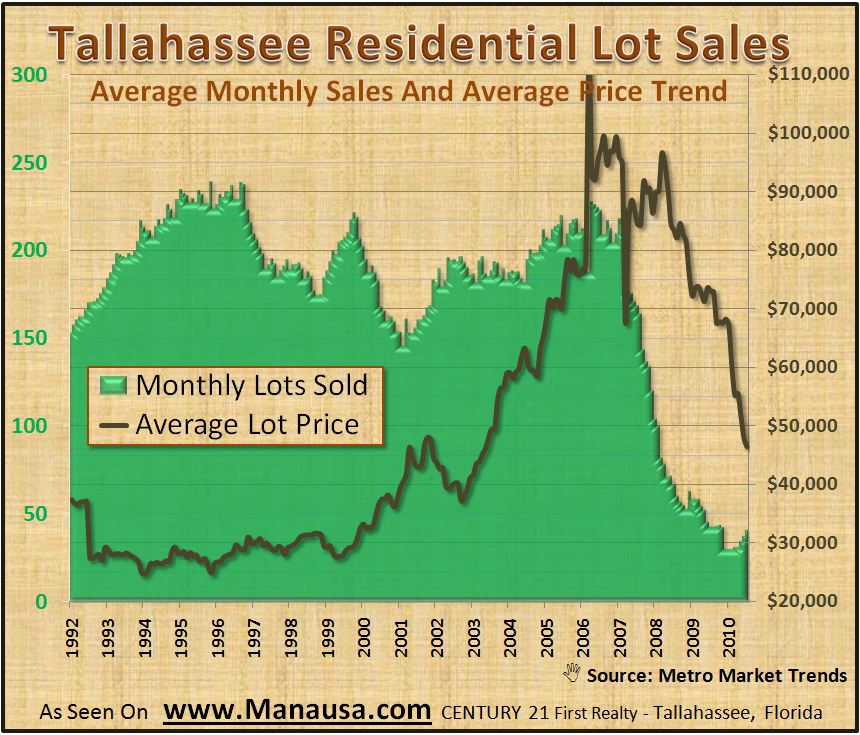
Tallahassee Lot And Land Sales Continue Decline
Lot and land sales have been hurting since the demand for new homes is so low. With our glut of homes not easing, the need for residential lots is many years off. I don’t expect the slide of land prices to end anytime soon.
Year Over Year Home Sales Report
After recent gains in the year over year home sales report, July posted a “no big surprises here” decline of 19%. We expected to see a decline with the end of the Homebuyer Tax Credit, which had helped create a run of 6 of the past 7 months as year over year gains.

Long Term Home Sales Trends
For those of you pure “chartists” out there, the following real estate graph shows long term home sales trends in Tallahassee. The short term trend (one year) is showing growth, but the five and ten year trends are in declines.

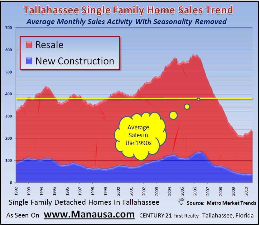
New Home Sales Versus Existing Home Sales
One graph that really shows the plight of home builders right now is the Average Monthly Home Sales Activity Report. The blue section of the real estate graph below represents new home sales, while the red measures the trend of existing home sales. As a ratio, it is the worst that new home builders have experienced during my 20 years in the business.
The Mother Of All Real Estate Reports
Time for some reader feedback. If you like this style of blog post (like to see one or two each month), let me know in the comments section below. If I don’t get any/many comments, I’ll figure not many people made it this far and it is not their cup of tea!