 If you remember back to the housing market expansion in the early 2000s, we saw the growth of “NINJA” loans, as they were a segment of the home sales explosion.
NINJA is an acronym for “No Income, No Job, and no Assets,” which meant that lenders were making loans to people who were not required to prove that they could repay the loans. It wasn’t that they did not necessarily lack income, jobs, or assets, it was just that they did not need to bring proof of any to their lenders.
Some of these loans worked out fine, but you can imagine how many ended up in foreclosure. Lately, I have been getting feedback from readers (and viewers on the Joe Manausa Real Estate Channel on YouTube) who are worried that NINJA loans are back in force and were driving the increase in home sales for the past few years.
Today’s post explores the current mortgage pipeline as reported by Black Knight, which allows us to forecast the future of loan delinquencies and comment on the impact of NINJA loans today on the US housing market.
US Mortgage Market Pipeline
Things are changing in the mortgage industry.
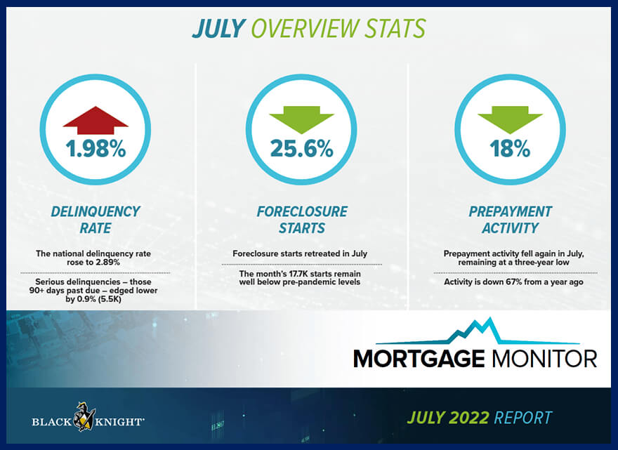
The mortgage delinquency rate rose nearly 2%, but as we’ll see later in the report, delinquencies are now at pre-pandemic levels and recently set a new all-time low.
Black Knight reports that foreclosure starts dropped more than 25%, and remain well below pre-pandemic levels. Any fears of a pandemic-induced foreclosure crisis have been put to rest.
Prepayment activity remains at a three-year low, which is understandable as the dwindling supply of distressed property (coupled with rising mortgage interest rates) has cooled the refinance activities that had been the top solution for delinquent borrowers due to the pandemic.
Before we move on, let me emphasize the importance of each ensuing step in today’s report. It will give you the FACTS, not hype, and you will have a clear understanding for any and all concerns about the US mortgage pipeline.
National Delinquency Rate For Mortgages
This graph plots the national delinquency rate on first-lien mortgages, an excellent barometer for anticipating a foreclosure crisis. It reports the percentage of mortgagors that are not up to date on their loan payments.

The dark line plots the quarterly delinquency rate, the light-green line plots the average recorded from 2000 through 2005, and the gray line plots the record-low delinquency rate. Here’s what we can conclude about the national delinquency rate:
-
The national delinquency rate rose slightly to 2.89% in July and is now slightly above the all-time low set a few months ago.
-
The national delinquency rate is now 36% lower than the pre-Great Recession July average of 4.51%.
-
With more than twenty years of history in the graph, it is clear that today’s borrowers are making their mortgage payments at a historically high rate.
These observations demonstrate the strength of the current housing market in terms of distressed properties and refutes any current claim that a flood of foreclosures is heading our way. But let’s dig deeper!
Current Delinquencies By Severity
This next graph segments mortgage delinquencies by severity so that we have a better understanding of the extent that borrowers are failing to make payments.

Overall, the trends are very positive, with the worst delinquencies showing huge declines and only new delinquencies showing gains. Perhaps the best takeaway from this graph is that only short-term delinquencies are rising (albeit at a very slow pre-pandemic rate).
This is a very important point that most real estate hypesters either fail to understand or purposely overlook in their reporting. Banks were not allowed to foreclose on most home loans that were delinquent during the pandemic until this year, so if a foreclosure wave was heading our way, we would have seen a huge number of foreclosure filings beginning in January. But we did not. And here is why:
The total number of delinquencies has been reduced by more than half since the start of the pandemic two years ago, and delinquencies are now lower than pre-pandemic levels (teal line). Serious delinquencies (those that have been delinquent for more than 90 days) have declined greatly in the past 17 months and are approaching the pre-pandemic level.
Forbearance – Loans Where Payments Were Paused
This graph provides information about the number of loans on active forbearance plans. As a reminder, a forbearance plan is an agreement between a borrower and a lender that, for an agreed-upon time, allows the non-payment (or partial payment) of a loan to help the borrower retain the home.
When the pandemic hit, many Americans feared for their jobs, and panic ensued. As part of the CARES Act, Lenders were required to offer voluntary forbearance plans to borrowers to help them through the turmoil.
There were nearly five million borrowers who went into forbearance at one point early in the pandemic. This action caused many self-proclaimed real estate experts to come out and call for a foreclosure wave that would cause massive home price declines in 2020, 2021, and again in 2022. They were wrong each time. As I had warned, home prices soared during those years due to the limited supply of homes for sale, and equity growth for homeowners created opportunities for most borrowers to resolve their issues without a foreclosure sale.
The remaining pipeline of loans in forbearance continues to decline and will soon be a footnote in housing market history. As you’ll see in the following pie chart, the forbearance plans successfully protected homeowners during the initial panic of the pandemic.
COVID-Related Forbearance Plans Today
This pie chart makes for a great picture as it shows what has happened to the 8.2 million loans in forbearance that were COVID related.
8.2M borrowers have been in forbearance at some point since the onset of the pandemic. 92% have since exited their plans, with 52% returning to making mortgage payments, and another 32% have paid off their mortgages in full.
Another 7% are still currently active in forbearance plans, leaving about 8% that are working through loss mitigation plans. Considering the equity growth of the past 3 years in housing, the majority should be able to satisfy most liens by selling their homes.
Keep Up With New Trends In Tallahassee!
Get The Tallahassee Real Estate Newsletter
 Don't be the one that doesn't know what's going on when you sell a home or buy a home in Tallahassee.
Other buyers, sellers, lenders, and real estate agents have this critical information, and now you can too!
Get immediate access to our most recent newsletter.
Let more than 30 years of experience work for you with charts, graphs, and analysis of the Tallahassee housing market.
Black Knight Home Price Index Jibes With Others
This graph displays the Black Knight Home Price Index, which I’ve included demonstrating that its data on home prices parallels my findings from several other data sources. I would not say that Black Knight is the best source of information to garner average home prices around the US, but I can tell you that what it reports looks familiar!

The 1-month percentage change in home prices is shown in blue (recorded on the right vertical axis) and the annual home price growth rate in green (recorded on the left vertical axis). As our previous reports have shown, home prices are soaring, with the current rate of 14.5% per year.
Home sales began cooling back in April due to sharply rising 30-year rates, and in July, we saw the first decline in the 1-month home price since 2019. Lately, average home-price declines are being reported in many markets, but I’m not certain that the average home is dropping in value.
It will take many more months of data to validate price changes versus value changes, and this is a hugely important point for you to understand. When mortgage rates rise, buyers cannot afford to spend as much; thus, we see the average home price fall. But this does not necessarily mean home values are falling.
Over the long run, home prices and values move in parallel, but during market changes, we often see them go in separate directions. For example, when interest rates fall, buyers can spend more, so in a market saturated with inventory (like we saw from 2006 through 2012), there were many times when average values fell while average prices rose.
The key to average home values rising or falling is the supply and demand dynamic which today still favors values rising. We would need a large influx of new construction, coupled with continued rising mortgage interest rates to threaten home values (both of which could very well occur over the next few years).
Slight Improvement In Home Affordability
One way to measure home affordability over time is to examine the ratio between monthly mortgage payments and borrowers’ income.

This graph plots the National Payment-to-Income Ratio. It is measured as the share of median income needed to make the monthly principal and interest payment on purchasing the average-priced home using a 20% down, 30-year fixed-rate mortgage at the prevailing interest rate.
The monthly payment required to purchase the average-priced home with a 20% down payment has declined in the past few months but is still far too high. I believe the recent improvements are due to rising wages, but we’ll need to see the trend continue a while longer to confirm (see my recent article on wage inflation versus rising housing costs for more on this topic).

Tallahassee Housing Economic Update

Tallahassee Florida Spring Economic Update

Tallahassee/US Housing Market Update Feb 2024

Which Home Sizes Are Skyrocketing In 2024?

Top 10 Neighborhoods to Live in Tallahassee for Families

Wealth Gap Widens Luxury Home Market Booms Unprecedentedly
How Bad Is It? SHOCKING Building Permits Report!

Top 10 Patio Home Neighborhoods In Tallahassee

Existing Homes Update - Tallahassee Real Estate
Still Not Enough Homes For Sale
This graph plots the current supply and demand for homes in the US by reporting the months of supply of homes for sale. As a reminder, 6.0 months of supply has traditionally been regarded as a balanced market, where neither sellers nor buyers have an advantage in the market.

The good news is that the relative supply of homes has risen. Unfortunately, it is due to declining demand, not rising supply. Though not shown here, today’s supply of just over 1.3M homes is far fewer than the four million plus homes in inventory at the highest point back in June of 2007. That means today’s supply is 70% lower than the market observed at its peak and is just above a 23-year low.
Shortage Of Homes Listed For Sale
I’ve been pleading for more inventory from builders since 2017, and I have produced MLS reports and graphs from FRED to support my concerns. Today, we’ll look at a Black Knight graph confirming a major inventory shortage.

Active listings remain 45% below pre-pandemic levels, though several markets around the US have inventory levels higher than before the pandemic. As an aside, it explains why I get comments on my videos and articles with people expressing concern for rising inventories.
It’s important to understand the bigger picture with this graph comparing inventories today with “average” inventories from 2017 to 2019. In 2017, the market had already hit a deficiency in the number of available homes, so the fact that we are another 45% fewer today explains why home values and rents have soared.
Housing Market Equity Is Safe
This graph shows the percentage of homeowners underwater with their mortgages during the 2nd quarter of each year going back to 2004.
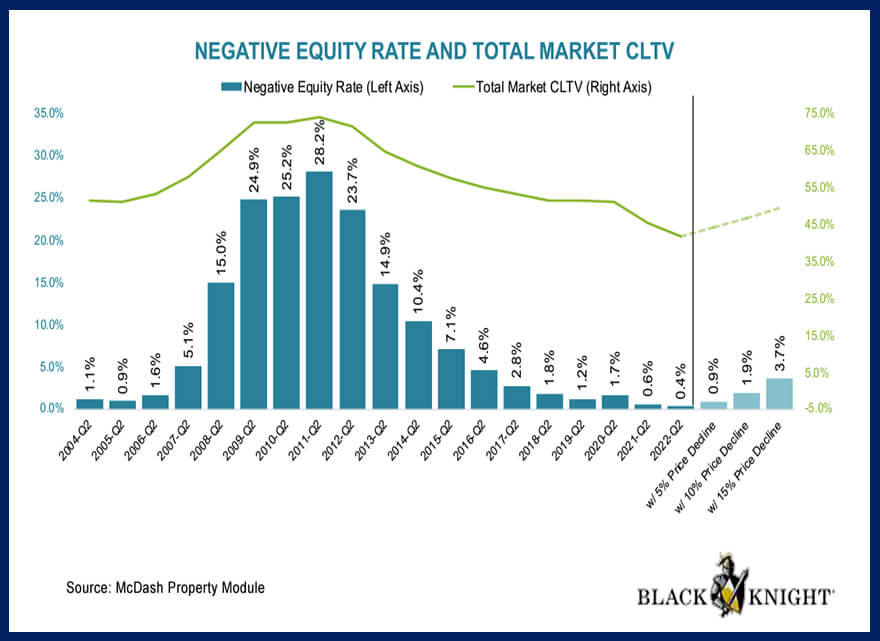
It plots the negative equity rate on the left vertical axis and the total market combined loan-to-value on the right vertical axis for the 2nd quarter of each year.
The second quarter posted the lowest quarter-end negative equity rate on record, with fewer than half of one percent of all mortgage holders owing more than their home’s current market value.
Total first and second lien U.S. mortgage debt was equivalent to less than 42% of the value of homes securing such debt, marking the lowest total market leverage on record. To be clear, the “average” mortgaged home in America has a combined loan-to-value of just 42%!
Contrast the peak of “bad times” in 2011 that resulted in 28.2% of all mortgages owing more than the mortgaged homes were worth with today, where less than 1/2% of all mortgages are upside-down.
The black vertical line separates reality from speculation to show what would happen if home values fell. With a 5% decline in home values, less than 1% of all mortgages would be in a negative equity position. With a 10% decline, less than 2% would be negative, and a 15% decline would result in less than 4% being negative.
There is significant equity in the housing market, more so than at any time in the past! For most borrowers who become delinquent today, the remedy does not have to be a foreclosure sale. Instead, delinquent borrowers can sell their homes on the open market, repay their debt, and many will walk away with equity!
Tappable Equity For US Mortgage Holders
This graph from Black Knight reveals what it describes as “tappable equity” in the housing market. It’s an estimated amount of money that could be withdrawn while still maintaining an 80% or lower loan-to-value ratio on homes in the US market.

While low inventory levels and rising home prices have distressed home affordability, they have simultaneously created record levels of equity growth for existing homeowners.
Tappable equity – the amount a homeowner can borrow against while keeping a 20% equity stake – hit its 10th consecutive quarterly record high in Q2 2022 at $11.5T but appears to have peaked in May of this year.
Escalating declines in June and July have total tappable equity down 5% over the past two months, suggesting a sizeable reduction is likely in Q3, which would mark the first quarterly decline in three years.
Currently, the tappable equity in the housing market is double the level recorded during the housing bubble in 2006.
How Big A Threat Are NINJA Loans Today
After this thorough analysis of the current mortgage pipeline, you can rest assured that NINJA loans are no threat to the US housing market. The pipeline sits at or below pre-pandemic levels for defaults, and there is more equity in the housing market than ever to help aid homeowners falling behind on their loans.
Our final graph in today’s report comes from CoreLogic data that shows the average credit score of homebuyers for the past 20+ years.

The graph above reveals that the government made it harder to obtain financing for home purchases in 2008, and it has only gotten tougher. The orange line in the graph reveals the average borrower in 2001 had a credit score below 700, whereas today it is above 720. The green line shows the “worst” borrower has seen the credit score requirement rise from 500 to well over 600. In simple terms, this graph shows the death of the NINJA loan.
NINJA loans were more common before the 2008 financial crisis. In the aftermath of the crisis, the U.S. government issued new regulations to improve standard lending practices across the credit market, which included tightening the requirements for granting loans (the impact of which is very clear in the graph’s green line). At this point, NINJA loans are rare, if not extinct.
Regarding the current mortgage pipeline, it looks incredibly strong, but some trends are turning. We’re coming off a record low for the inventory of homes for sale and the month’s supply of homes, so we’ll continue to monitor consumption in the housing market.
The biggest threat to housing remains home affordability, but as wage inflation grows, we could very well see continued improvement in the amount of disposable income being spent on buying and renting homes.
Will builders deliver too many homes for the dwindling number of homebuyers after the Fed raises rates (AGAIN and AGAIN)? Or will wage-inflation-aided demand return as builders struggle with supply-chain issues and slow-to-market time frames? These are the trends we’re monitoring, and we’ll continue to report with data-centric clarity as the future months unfold.
If you think I’ve missed a key point in this mortgage pipeline report, please share it with us by posting a comment below.

Housing Crash or Boom? Here’s What’s Coming in 2025

BIGGEST Housing Market Myth EXPOSED by New Foreclosure Data
There are a lot of people who endorse Joe for the job of selling your home, including Preston Scott (host of Tallahassee's top daily "Audio Magazine," as well as the thousands of happy customers Joe has helped in the past. Listen why!


