 A viewer on our YouTube Channel left an interesting comment this past weekend that really had my head spinning. He wrote:
I checked the redfin data center. The 4-week rolling average price per square foot was $212 in May. Consistent and steady price drops each week until now in July/August at $201. Even the median price per square foot is dropping. ~GUG
Now, he had my attention.
After all, I’ve been reporting the gross lack of supply and enough demand to continue to fuel appreciation, so how is it that a real estate website can report that home prices are dropping?
When I went to the Redfin data site, I found what he reported was true. I was initially perplexed, but after digging deeper, I found the “devil in the details” that you should know.
Today’s post serves to remind us that you can read almost anything into data so you must really pay attention and scrutinize what you are seeing. I will take you on a brief journey, starting with the graph that got this whole topic rolling, to show you how good data can yield accidental interpretations when not properly evaluated.
Median Home Sales Price In All Redfin Metros
This is the graph that caught our viewer’s attention.

The graphs above plot the median sales price (upper) and the year-over-year change of the median sales price (lower). The black line shows that the median home price has come down.
I spent several minutes looking at this thinking (how can that be), so I decided to really dig in.
I have added some prices to the graph (shown below) that one can obtain by hovering over the Redfin graphs on their website.
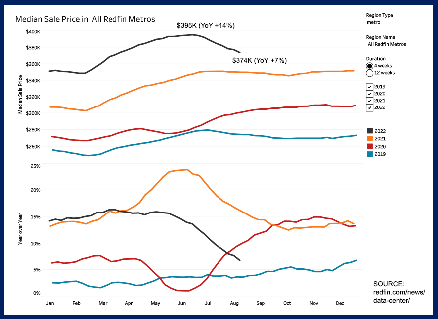
The numbers added to the graph show the price decline and the reduction of the year-over-year gains, just as our viewer had mentioned. But then I caught the devil in the details (highlighted below).
Get Our Free Market Update
Other buyers, sellers, lenders, and real estate agents have this critical information, and now you can too!
Get immediate access to our most recent newsletter.
Let more than 30 years of experience work for you with charts, graphs, and analysis of the Tallahassee housing market.
Each Monday morning we send out a simple, one-page report that provides a snapshot of the Tallahassee housing market. It only takes 2 minutes to read, but it gives you better market intelligence than most real estate agents possess. Just tell us where to send it below!
This graph plots information for a four-week period of time. Is what we are seeing the bottom of the market falling out?

Years 2019 through 2021 plot four weeks of change at the end of each respective year, while 2022 plots the most recent four weeks, and we clearly see a decline in home prices. But this is where I had my “Ah Hah!” moment.
Rather than fixate on a four-week period, let’s zoom out to see if those four weeks are significant.
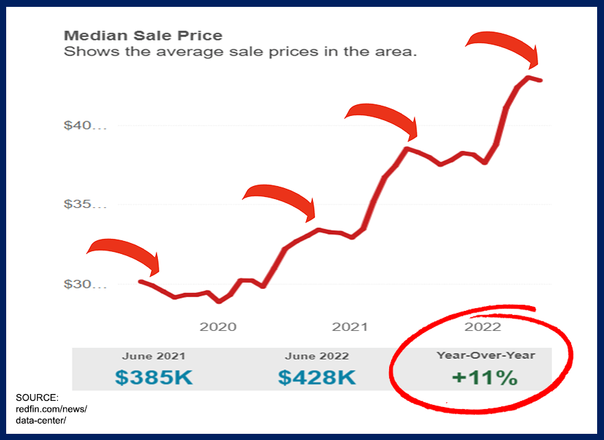
When we study the median home price over time, we do not see straight-line appreciation or depreciation, rather we see a jagged series of a generally rising trend.
In fact, in each year plotted on the graph, we find declines in the median home price. What we are seeing right now we have seen before (during the highest run-up in home prices in more than 15 years).
Now, that doesn’t mean a downward trend hasn’t started, it is just far too early to say. Think about how many times one would have thought prices were dropping if we only studied four-week windows in the past!
When we lengthen our graph of the median home price to the past ten years in a few key metro areas (as well as the national plot), we find that there is a recent dip at the US level, while various markets are rising and others are falling.
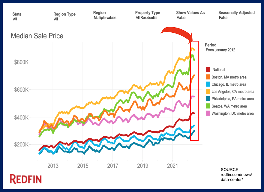
I have boxed in the previous five months to isolate this period from all others. Do you see anything different than what has happened since 2012? To me, the progression appears to be unchanged. Only hindsight will prove me right or wrong.
Median Home Value In All Redfin Metros
One of the fallacies of tracking the median home price to determine whether home prices are falling or rising is that the median or average home price is more of an indicator of what buyers are spending (rather than the change in values of homes).
Instead, it is far more prudent to track the median home value (measured in price per square foot). If buyers have less money to spend (rising mortgage interest rates have made this so), then are they buying the same house for less money, or are they buying less house?

This graph shows that the median home value has moved higher like home prices, with a ragged ascent to today’s higher ground. Again, we see the national average on a tiny decline, but it is far too early to announce a decline for home sellers.
Redfin provides a great resource to assess current changes in the market, unlike the other reporting agencies that are often weeks or months behind. I have learned that I need to read the graph instructions closely!

Fannie Mae Report: It's The TRUTH About The Housing Market

Real Estate Meltdown: Starter Homes at $1M in 233 Cities

Is the Housing Market Crashing? | Redfin April 2025 Update

Is This The CALM Before The CRASH? Volatility Rocks Housing

Warning Signs For Home Buyers And Sellers
New Construction Premium Points To Higher Prices
This graph was produced from my Tallahassee data set, which allows me to be very recent with my data. It plots the monthly median price per square foot of both new and existing homes, calculates the difference between the two (the new construction “premium” that buyers pay to get a new home), and then converts them to five-year trend lines.
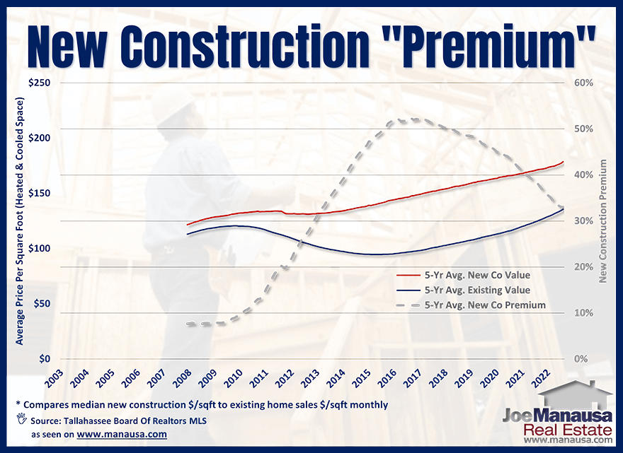
This graph starts with data from 2003 and shows the new construction premium has jumped from an average below 10% to as high as more than 50% back in 2016. When I looked back to dates before this graph, the premium was typically in the 5 to 15% range. Today, the five-year trend has dropped to 32%.
The combination of wage growth and the COVID-related supply disruptions have made homebuilding very expensive. We might see some relief from material costs, but as one local builder pointed out, “we won’t see labor costs come down. In fact, they are soaring.”
Of all the graphs in this report, I believe this one provides the best evidence that home prices will continue to increase. Yes, I expect the trajectory to slow, but I expect a jagged move upwards, just as we have seen in the past.
One must remember that increased labor costs impact all material costs, including the transportation of those materials. Additionally, the cost of land is moving higher, too, as NIMBYism (see video above) is making it so difficult to get new homes developed today.
The inventory of homes in the US has not kept up with population growth, and thus the new homes coming to the market will be at prices much higher than before. So long as the inventory shortage remains, we expect the upward trend to continue.
There are a lot of people who endorse Joe for the job of selling your home, including Preston Scott (host of Tallahassee's top daily "Audio Magazine," as well as the thousands of happy customers Joe has helped in the past. Listen why!


