 Is the American Dream of homeownership slipping through our fingers? With home prices and rents soaring at unprecedented rates, the U.S. faces a housing crisis that threatens not only individual dreams but also the fabric of our communities.
Zillow has just dropped a bombshell: seven critical graphs that decode the complexities of today’s U.S. housing market and predict its future trajectory. If you’ve ever wondered why home prices are skyrocketing or why your dream home feels increasingly out of reach, this comprehensive analysis is your roadmap. Don’t miss this essential read—it unpacks the data that could determine your next housing decision.
Read on to discover the surprising factors contributing to this nationwide dilemma, why merely hoping for lower prices won’t solve it, and the urgent call to action that could safeguard our collective future.
How Many Homes Are Selling?
Our first graph paints a clear image of the declining demand in the US housing market.
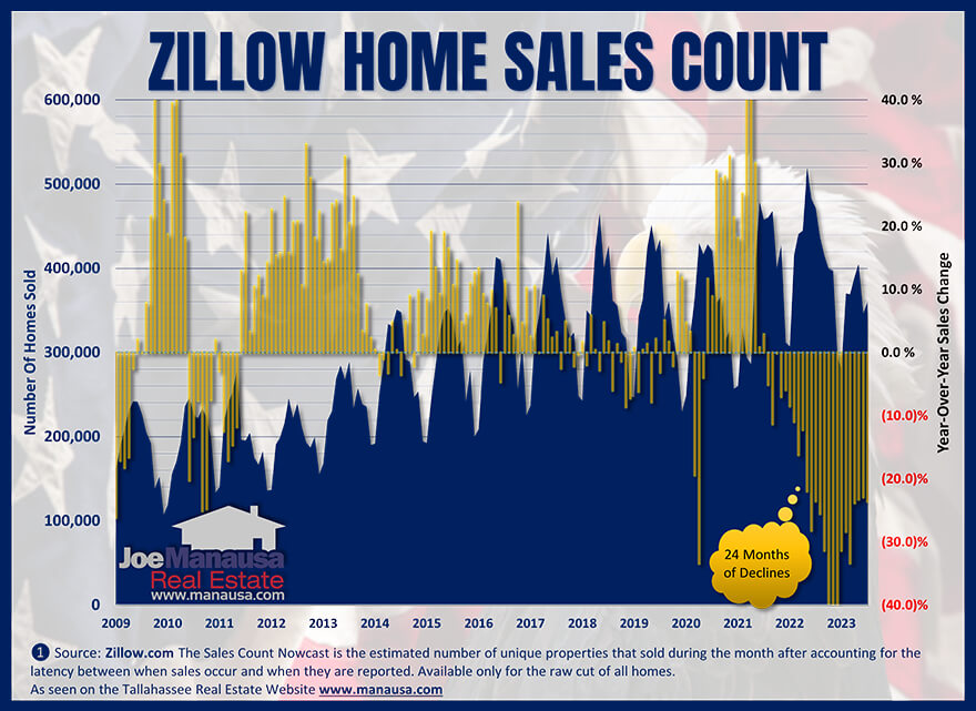
The blue bars in this graph indicate the monthly home sales and the yellow bars show the year-over-year change for each month. For instance, 275K homes were sold in August, marking a nearly 24% decrease from the 360K homes sold in August of last year.
U.S. home sales have dropped for 24 consecutive months. This decrease began when mortgage interest rates doubled, strongly linking the decline in buyer interest to reduced home affordability. Furthermore, many potential buyers currently hold mortgages with rates below 3%. The prospect of facing rates above 7% makes it nearly impossible for them to consider moving.
How Many Homes Are For Sale?
Understanding the demand has declined, let’s shift our focus to the supply side of the US housing market.

The blue bars in this graph represent the number of unique active home listings for each month, while the red line indicates the year-over-year change in available homes for sale. There are 950,000 homes on the market, which is a 13% decline from the 1.092 million homes available last year. It’s important to note, though not shown in this graph, that today’s listings are 76% lower than the numbers during the housing bubble years.
Back in 2008, there were far too many homes for sale when the government chopped away at available loan programs. The oversupply caused prices to fall. The opposite condition exists today. A healthy housing market should maintain an inventory of 2 to 3 million available homes, so today, we are terribly undersupplied. This shortage has skyrocketed home values and rental rates, creating an unsustainable and unhealthy housing market.

Housing Crash or Boom? Here’s What’s Coming in 2025

BIGGEST Housing Market Myth EXPOSED by New Foreclosure Data
Zillow Forecast For 894 Local Markets
Even with diminished demand, the lack of available homes has created pricing pressures in most local US housing markets.

Zillow is forecasting an average appreciation rate in the US of 4.9% for the next twelve months and sees 92.2% of all local US housing markets post gains in home prices.
Sure, some markets are defying the overall US trend, but if you are reading this, you are likely in a market where home prices will continue to grow. The lack of inventory will keep declining demand in check, so don’t expect home affordability to improve any time soon.
Median Home Sales Price Continues Higher
Many people hoped for a decline in home prices, but as we predicted, that outcome was unlikely given the underbuilt state of the U.S. housing market.

The blue bars in this graph display the median sale prices for homes across various U.S. metropolitan areas, while the red line tracks the year-over-year change in these median prices. A dashed line marks the zero-percent point for year-over-year change in median home prices.
Although we saw a period of decline in year-over-year home prices last year, that phase has ended. Last month, the year-over-year median price increased by nearly 5%, which Zillow anticipates will continue for the next twelve months. So, what do those who previously warned of falling home prices have to say now?
The findings in this graph align with supply and demand analyses. As demand decreased, the supply of available homes also shrunk. Many potential sellers, who are also prospective buyers, chose not to move, thus reducing future inventory.
Homebuilders have not been producing enough residences to meet the needs of our growing population. Until we return to traditional building rates, we can expect the home affordability crisis to worsen.
Get Our Free Market Update
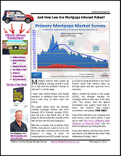
Other buyers, sellers, lenders, and real estate agents have this critical information, and now you can too!
Get immediate access to our most recent newsletter.
Let more than 30 years of experience work for you with charts, graphs, and analysis of the Tallahassee housing market.
Each Monday morning we send out a simple, one-page report that provides a snapshot of the Tallahassee housing market. It only takes 2 minutes to read, but it gives you better market intelligence than most real estate agents possess. Just tell us where to send it below!
What Are Home Sellers Receiving?
According to Zillow, home sellers are receiving their full asking prices.

This graph displays the mean sale-to-list ratio, which is the sales price divided by the final list price.
Historically, we expect this ratio to fall between 97% and 98% for the overall market. However, due to limited inventory, sellers are commanding the market across most price ranges and areas.
Just over a year ago, this ratio soared to more than 102%, a level I’ve never seen in my 32 years in the industry. Our housing market is currently imbalanced, with home prices escalating too rapidly. To stabilize the situation, we urgently need to increase home construction before conditions deteriorate further.
Are Home Value Changes Equal Across All Price Points?
Zillow divides the housing market into three equal tiers, ranging from high to low, to assess variations across different price points. This segmentation allows for a more nuanced understanding of market dynamics.

In this graph, Zillow presents the year-over-year percentage change in the home value index for each of the three price tiers: the top tier in blue, the middle tier in red, and the bottom tier in gray.
At first glance, it seems that all three tiers follow a similar trend, although the top tier exhibits slightly more volatility than the others. However, a concerning pattern emerges after examining the entire data set, which spans from 2001 to the present. Here are the annual growth rates for each tier:
- Top Tier: 4.68%
- Middle Tier: 4.80%
- Bottom Tier: 5.07%
The rates of home price appreciation are not uniform across these tiers. Notably, the fastest growth is happening in the least affordable tier, exacerbating housing affordability issues.

Fannie Mae Report: It's The TRUTH About The Housing Market

Real Estate Meltdown: Starter Homes at $1M in 233 Cities

Is the Housing Market Crashing? | Redfin April 2025 Update

Is This The CALM Before The CRASH? Volatility Rocks Housing

Warning Signs For Home Buyers And Sellers
What Rental Rates Tell Us About Home Affordability Change
The last graph in this report showcases trends in U.S. rental rates, serving as a valuable indicator to either refute or confirm the existence of a supply shortage in the overall housing market.

The graph displays two sets of data for rental rates: one for the typical U.S. market and another for the local market in Tallahassee.
The solid blue line represents the observed average rent in the U.S., while the blue-dashed line portrays Tallahassee’s rental market. Similarly, the solid red line indicates the year-over-year change in U.S. rental rates, and the dashed red line shows the same metric for Tallahassee. This comparison provides valuable insights into local and national rental rate trends.
Both the U.S. and Tallahassee rental rates continue to rise, although at slower rates compared to the last two years. Nevertheless, these increases are still above historical norms. When both home prices and rental rates escalate at rates higher than historical averages, it clearly indicates that a housing shortage is at the core of the issue.
We Must Prioritize Balance In The Housing Market
The current state of the U.S. housing market demands immediate and decisive action. While the challenges to restoring equilibrium are multifaceted and often divisive, inaction is not an option. If we fail to act, we risk escalating the housing affordability crisis to a point where the majority of Americans will find themselves renting from large investment funds, rather than building equity through home ownership.
The government’s interference in the mortgage market in 2006 initiated a shock wave, disrupting “normal operations” in housing for a decade and leading many homebuilders to halt production at traditional rates. Consequently, we find ourselves in a housing paradox: America desperately needs more homes, but escalating costs in today’s inflationary market render building at scale virtually unfeasible.
Ignoring the supply-demand dynamics will only worsen the situation. Unless you anticipate a drastic decrease in U.S. population, maintaining the status quo is not an option. Given that we foresee slow to moderate population growth, we must parallelly strive for a comparable increase in housing inventory.
The time for half-measures is over. Continuing to produce homes at merely one-third of historical rates is untenable. We must rally our resources, unify our efforts, and prioritize housing construction to redress this imbalance. The cost of inaction is too great; it’s time to build our way out of this crisis.

How To Sell Your House On Your Own

10 PROVEN Strategies To Increase A Home's Selling Profit

2025s HOTTEST Home Selling Strategies You Need NOW
The 3-DAY Method To Sell Your Home For More (2025)

The Best Time To Lower The Price In A Home Sale

How FOMO Makes Your Home Sale More Profitable

Home Sale Sabotage: Top 10 Mistakes Sellers Make
There are a lot of people who endorse Joe for the job of selling your home, including Preston Scott (host of Tallahassee's top daily "Audio Magazine," as well as the thousands of happy customers Joe has helped in the past. Listen why!


