The way we estimate housing market equilibrium has changed, and with it, the way the market is evaluated must change.
Market equilibrium is the theoretical balance where the supply and demand for homes are equal. Over time, the market seeks equilibrium, but a balance is seldom achieved for any period. The old rule of thumb that six months’ supply of homes for sale is “about right” is regularly used to make decisions that impact market behavior for a long time, but this “rule” must be revised.
An adjusted definition of market equilibrium means changes to how we measure buyers’ and sellers’ markets, and it will impact the forecasting models that home builders use to determine their production expectations and planning. The concept of market equilibrium is the foundation of all real estate forecasting (which includes advising homeowners of property values).
Somebody using the old standard will have different forecasts and expectations than someone using the new standard.
Today, we’ll look at why our measure of market equilibrium has changed, to what degree it has changed, and how the change will influence our measurements and forecasting for the future of US home sales.
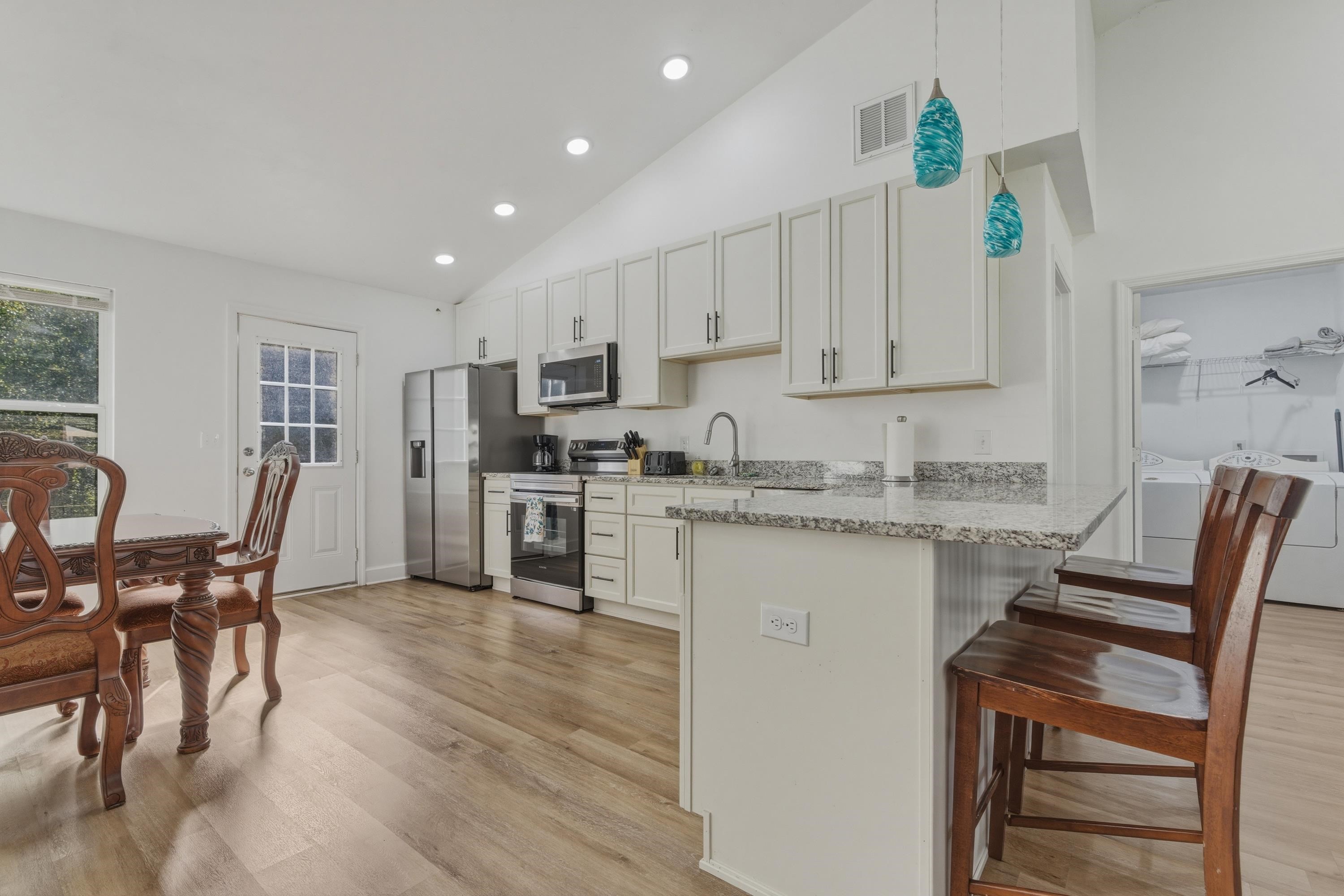
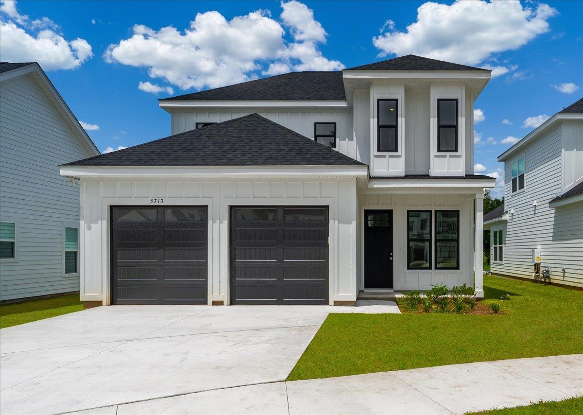
Active Listings In Tallahassee
The following listings are available today in Tallahassee. I include them in this report as anecdotal evidence to accentuate and support the succeeding graphs that report a depleted inventory of homes for sale in the US.
Homes For Sale In Tallahassee, Florida


Housing Market Equilibrium Explained
Housing market equilibrium has often been estimated to be about six months’ supply of homes for sale. In the past, when the market was near equilibrium, we expected homes to appreciate at roughly 3.5 to 4% per year, and home sellers could put a home on the market and expect a sale within six months.
I went into great detail explaining how the change came about in this article if you would like a more thorough explanation. But to keep things short here, I will simplify the discussion to the simple fact that digital marketing and changing consumer expectations have sped up sale times by about two months. What once took roughly 60 days to reach the full market of buyers for a home now only takes about 4 days, so we can reduce the required supply of homes by two months, from six to four.
Housing Market Equilibrium visualized
This simple graphic explains how housing market equilibrium is measured and how the change will impact subsequent measurements.

The bottom of the graph shows a neighborhood of homes representing “Supply”, while the top half shows a crowd of people representing “Demand.” On the far left, there is high supply and low demand, while the opposite can be found on the right side of the graph, where demand dwarfs supply. The months of supply of homes are plotted on the horizontal axis.
The blue dashed line shows the historically accepted market equilibrium at 6.0 months of supply, while the red dashed line plots 4.0 months of supply, a more accurate reflection of a balanced market in the digital marketing era. The new equilibrium means future buyers will have fewer homes to view than buyers did in the past.
Get Our Free Market Update

Other buyers, sellers, lenders, and real estate agents have this critical information, and now you can too!
Get immediate access to our most recent newsletter.
Let more than 30 years of experience work for you with charts, graphs, and analysis of the Tallahassee housing market.
Each Monday morning we send out a simple, one-page report that provides a snapshot of the Tallahassee housing market. It only takes 2 minutes to read, but it gives you better market intelligence than most real estate agents possess. Just tell us where to send it below!
Applying The New Housing Market Equilibrium
This chart shows the relative supply of homes for sale in Tallahassee, FL, a local example that mirrors the overall US housing market.

Using the traditional definition of market equilibrium, we would say that the market hit equilibrium in 2016 (the left gold star), but the revised definition of market equilibrium shows it was reached in 2018. In 2020, the market moved further into an inventory deficit and has progressively gotten tighter through today.
Tallahassee has not seen a reversal in the relative supply of homes for sale, but as you will see in the next graph, the US has moved up from the bottom. It’s important to remind our reader that the supply and demand dynamic for homes locally (hyper-locally) is used to determine home price growth in any area.


How To Sell Your House On Your Own

10 PROVEN Strategies To Increase A Home's Selling Profit
2025s HOTTEST Home Selling Strategies You Need NOW

The 3-DAY Method To Sell Your Home For More (2025)

The Best Time To Lower The Price In A Home Sale

How FOMO Makes Your Home Sale More Profitable

Home Sale Sabotage: Top 10 Mistakes Sellers Make
US Housing Supply And Demand
The relative supply of homes for sale in the US is finally rising for the first time in three years.

This graph plots the number of homes for sale in the US (blue lines reported on the left vertical axis) and the relative supply of homes for sale in red (red line measured in months of supply on the right vertical axis) to produce the one-year trend of the relative supply of homes for sale (gray dashed line measured on the right vertical axis).
Today’s relative supply of homes at 2.5 months is far below either definition of market equilibrium. This means that the housing market remains undersupplied for the current demand and that home prices are expected to rise until (unless) we see demand plummet even further. Though we see falling prices in some local markets, most US markets still show year-over-year gains.
Local Supply And Demand By Price Range
This is another graph using data from the Tallahassee real estate market, though it too will parallel what most US housing markets reports. The prices in your area might be higher or lower, but the relative supply will be distributed similarly.

In this graph, the market has been segmented at fifth-thousand dollar intervals up to $1M, and all homes above $1M are reported together. The blue bars measure the month’s supply of homes for sale (the relative supply of homes). The yellow field identifies the old measure of market equilibrium, while the blue field highlights the new measurement of housing market equilibrium.
Regardless of the definition, homes priced below $450K in Tallahassee are undersupplied. As we move to higher prices, there are fewer homes, so we see fluctuations in the graph. Roughly reported, I would say that under the old definition, the market is oversupplied above $750K, whereas the new definition might say it’s oversupplied above $550K.
That doesn’t mean there aren’t areas in Tallahassee that report different numbers, as not all parts of any city are valued the same.
The key takeaway from this graph is that the market is split. Homes priced in the lower half of the market exist in a strong seller’s market, where demand far exceeds supply and home prices are rising faster than the historical norm. Homes priced among the higher half of the market are slightly oversupplied, so there is pressure on home prices.
Most local markets are observing a similar dynamic, so it should now make sense when you hear conflicting reports on home price changes.

Buy Now Or Wait? The 91.6% Rule

Biased Results? The New York Times Rent Or Buy Calculator

Do's And Don'ts During The Home Loan Process

6 Real Estate Contract Terms You Should Not Overlook

7 Tips On Buying A Home With A Pool

How much house can you actually afford (By Income)?

What Does "Marry The House Date The Rate" Mean In Real Estate?

Why Fixer Uppers Are the New Gold | Home Renovation Guide