
Weekly Special | December 7, 2015
Recycled Listings Showing Major Changes
The market is cleaning up distressed properties at a speedier rate now.
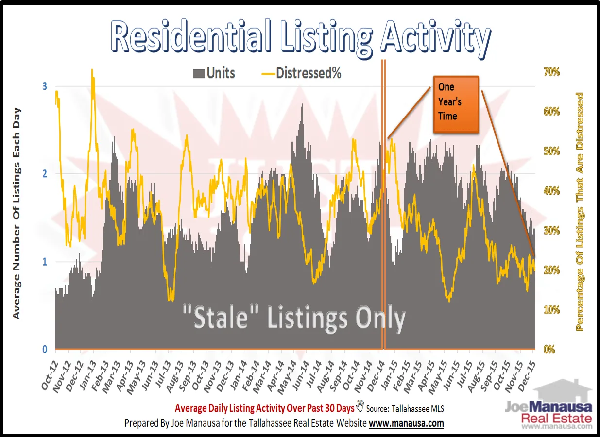
In the graph above, we measure the percentage of distressed homes among the stale listings in the Tallahassee MLS. We refer to listings that are hitting the market again as stale (versus fresh listings which are homes entering the market for the first time).
The gold line in the graph shows the ratio of distressed homes to all homes listed, and the change over the past twelve months has been great. At this time last year, roughly 50% of all recycled listings were distressed, but currently that ratio has dropped by more than 1/2. I believe this is a sign that some of the stale homes are finally being purchased, cleaned up, and getting sold. This will have a positive impact on home values and the quality of the homes that are available to buyers.
The graph below shows the number of fresh (blue) versus stale (orange) homes coming onto the market, and the ratio of stale homes continues to fall as well.
This means a greater percentage of home sellers are finding success when they enter the market, and buyers today are seeing a fresher supply of homes.
The original one-page Weekly Special PDF is still available.
Get the Weekly Special Every Monday
Each Monday morning the Weekly Special takes one Tallahassee housing question, answers it with a chart of local sales, and explains what it means for your next move.
It is free, and you can unsubscribe any time.