
Weekly Special | April 11, 2022
New Record High For Inventory Turnover
Are you wondering how today compares to a “normal” market for home sellers? If so, today’s report answers your question.
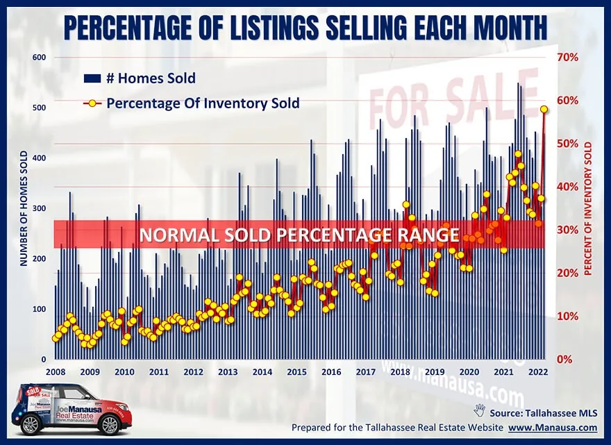
This graph takes a look at how sellers are doing compared to “normal” times by plotting the percentage of listings that sell each month (yellow dots measured on the right vertical axis).
The red field has been considered the “normal range” for the past thirty years that I have been selling homes in Tallahassee. When the yellow dots fall below the red field, the percentage of homes selling is fewer than normal. The opposite is true when the yellow dots rise above the red field.
During the housing market crash and recovery from 2007 through 2015, we saw lower than normal sales percentages. This means that supply was higher than demand and as little as 3% of homes listed for sale were actually selling in any given month.
But times change. For the past two years, more than a third of all listings sold each month, but the biggest shocker is what occurred in March. Nearly 60% of the inventory closed in March (roughly double the percentage we’d find in normal market conditions).
This means that demand remains significantly higher than the current supply and the inventory is turning-over much more quickly than what has been seen as normal. This remains the best time for selling a home within a predictable time frame that I have seen in the past 31 years!
The original one-page Weekly Special PDF is still available.
Get the Weekly Special Every Monday
Each Monday morning the Weekly Special takes one Tallahassee housing question, answers it with a chart of local sales, and explains what it means for your next move.
It is free, and you can unsubscribe any time.