
Weekly Special | March 27, 2023
The Return of the Foreclosure Monster?
This week’s graph addresses a very hot topic on social media … the crash of the housing market that will result in millions of foreclosed homes.
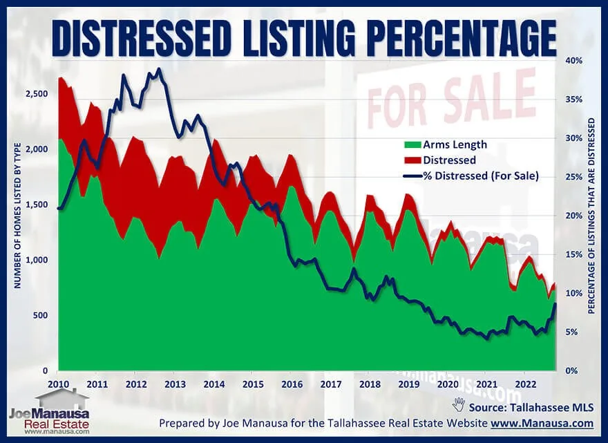
Since so many people are expecting significant price declines that lead to foreclosures (like we saw during the housing bubble 15 years ago), I felt it might be a good time to evaluate the current status or health of home sellers in the Tallahassee housing market today.
The graph above plots all homes for sale, with the green area measuring the number of arms-length home sellers, while the red area plots the number of distressed home sellers.
The blue line plots the ratio of distressed property listings to all properties listed, and we see that there is a sharp rise in the distressed ratio that began about a year ago.
While this looks like confirmation that the housing market is heading into a foreclosure crisis, it requires diving deeper to understand what you are really seeing.
Numbers Lie Numbers don’t lie, but people use numbers to lie all the time. The sharp increase you see in the graph is NOT a sharp increase in distressed properties, rather it reveals a greater percentage of listings that are in distress. With fewer homes on the market from healthy home sellers, the same number of distressed sellers represent a greater percentage. The number of distressed listings today is very similar to the pre-COVID listing count in early 2020.
The original one-page Weekly Special PDF is still available.
Get the Weekly Special Every Monday
Each Monday morning the Weekly Special takes one Tallahassee housing question, answers it with a chart of local sales, and explains what it means for your next move.
It is free, and you can unsubscribe any time.